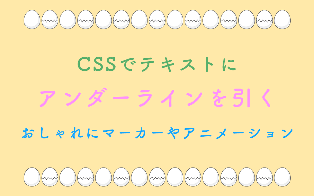
Webデザインにおいて、テキストにアンダーラインを引くことは、リンクの表現や重要な箇所の強調に欠かせない技術です。
CSSでテキストにアンダーラインを引くには、text-decoraitonやborder-bottom,backgroundを使った手法があります。
おしゃれにマーカー風やアニメーションのアンダーラインも表現できます。
💡この記事でわかる事
この記事ではCSSを使って、アンダーラインを引くために以下の内容を習得することができます:
- text-decorationを使ったアンダーライン
- border-bottomを使ったアンダーライン
- backgroundを使ったおしゃれなマーカー風アンダーライン
CSSでアンダーラインを実装する様々な方法を、基本から応用まで詳しく解説します。
text-decorationを使ったcss のアンダーライン
1. 基本的なアンダーライン:text-decoration
最もシンプルなアンダーラインの引き方は、text-decorationプロパティを使用する方法です。
.underline {
  text-decoration: underline;
}text-decorationの主な値
underline: 下線を引くoverline: 上線を引くline-through: 取り消し線を引くnone: 線を消す(リンクのデフォルトアンダーラインを消す際に便利)
2. アンダーラインのカスタマイズ (色、太さ、タイプ)
CSS3以降、アンダーラインをより細かくカスタマイズできるようになりました。
線のスタイルを変える
.custom-underline {
  text-decoration: underline;
  text-decoration-style: wavy;/* 波線 */
  text-decoration-color: #ff6b6b;/* 色指定 */
  text-decoration-thickness: 2px;/* 太さ指定 */
}text-decoration-styleの種類:
solid: 実線(デフォルト)double: 二重線dotted: 点線dashed: 破線wavy: 波線
See the Pen css underline色ー太さー線種 by naoq (@naoq) on CodePen.
3. ショートハンドで一括指定
1行でまとめて書く事もできます。
.shorthand {
  text-decoration: underline wavy #ff6b6b 2px;
}4. アンダーラインの位置を調整
アンダーラインとテキストの距離を調整したい場合は、text-underline-offsetプロパティを使用します。
.offset-underline {
  text-decoration: underline;
  text-underline-offset: 30px;/* 下に30px離す */
}cssの変更を加えて、挙動を確認してみてください。
See the Pen css underline位置 by naoq (@naoq) on CodePen.
5. CSSプロパティtext-decorationのブラウザ対応状況
最新のCSSプロパティを使用する際は、ブラウザの対応状況を確認しましょう。
text-decoration-thickness: 主要ブラウザで対応済みtext-underline-offset: 主要ブラウザで対応済みtext-decoration-style: 主要ブラウザで対応済み(一部スタイルに制限あり)
古いブラウザもサポートする必要がある場合は、フォールバックを用意しましょう。
.underline {
/* フォールバック */
  text-decoration: underline;

/* 対応ブラウザでは詳細指定 */
  text-decoration-color: #ff6b6b;
  text-decoration-thickness: 2px;
  text-underline-offset: 3px;
}border-bottomをcssのアンダーラインに
より自由度の高いアンダーラインを実現したい場合は、border-bottomを使用する方法もあります。
.border-underline {
  border-bottom: 2px solid #333;
  display: inline-block;/* インライン要素の場合 */
}text-decorationとborder-bottomの違い
text-decorationの利点:
- 文字の下行に配置される
- 改行しても自然に続く
- 下付き文字を避けて線が引かれる
border-bottomの利点:
- 線の太さや種類を細かく制御できる
- paddingで線との距離を自由に調整できる
- アニメーション効果を付けやすい
点線・破線:ボーターボトムとtext-decoration
強調しすぎない、控えめなアンダーラインを作りたい場合に便利です。
.dotted-underline {
  text-decoration: underline;
  text-decoration-style: dotted;
  text-decoration-color: #999;
}

.dashed-underline {
  border-bottom: 1px dashed #666;
  text-decoration: none;
}グラデーションをアンダーラインに
現代的なデザインには、グラデーションのアンダーラインも効果的です。
.gradient-underline {
  position: relative;
  text-decoration: none;
}

.gradient-underline::after {
  content: '';
  position: absolute;
  bottom: 0;
  left: 0;
  width: 100%;
  height: 3px;
  background: linear-gradient(to right, #c093fb, #f5576c);
  opacity: 0.8;
}See the Pen グラデーションのアンダーラインも効果的 by naoq (@naoq) on CodePen.
ホバー効果のあるアンダーラインのアニメーション
リンクにマウスを乗せた時のアニメーション効果は、ユーザー体験を向上させます。
左から右へ伸びるアンダーライン
.hover-underline {
  position: relative;
  text-decoration: none;
  color: #333;
}

.hover-underline::after {
  content: '';
  position: absolute;
  bottom: 0;
  left: 0;
  width: 0;
  height: 2px;
  background-color: #ff6b6b;
  transition: width 0.5s ease;
}

.hover-underline:hover::after {
  width: 100%;
}文字列にマウスを合わせてみてください。↓
See the Pen 左から右へ伸びるアンダーライン by naoq (@naoq) on CodePen.
中央から広がるアンダーライン
.center-underline {
  position: relative;
  text-decoration: none;
}

.center-underline::after {
  content: '';
  position: absolute;
  bottom: 0;
  left: 50%;
  width: 0;
  height: 2px;
  background-color: #4ecdc4;
  transition: all 0.3s ease;
  transform: translateX(-50%);
}

.center-underline:hover::after {
  width: 100%;
}文字列にマウスポインターをホバーさせてください。↓
See the Pen 中央から広がるアンダーライン by naoq (@naoq) on CodePen.
アンカー要素に対するアンダーラインのテクニック
/* 基本のリンクスタイル */
a {
  color: #0066cc;
  text-decoration: none;
  position: relative;
}

/* デフォルトは細いアンダーライン */
a::after {
  content: '';
  position: absolute;
  bottom: -2px;
  left: 0;
  width: 100%;
  height: 1px;
  background-color: #0066cc;
  opacity: 0.3;
}

/* ホバー時は太く濃く */
a:hover {
  color: #0052a3;
}

a:hover::after {
  height: 2px;
  opacity: 1;
}

/* 訪問済みリンク */
a:visited {
  color: #551a8b;
}See the Pen アンカー要素に対するアンダーラインのベストプラクティス by naoq (@naoq) on CodePen.
アクセシビリティへの配慮
アンダーラインを扱う際は、以下の点に注意しましょう。
- リンクとテキストの区別: リンクであることが視覚的に明確であること
- 色だけに頼らない: 色覚異常のユーザーのために、アンダーラインなどの視覚的手がかりを残す
- コントラスト比: 背景色とのコントラスト比を4.5:1以上に保つ
/* 悪い例:色だけでリンクを区別 */
a {
  color: blue;
  text-decoration: none;
}

/* 良い例:アンダーラインも併用 */
a {
  color: blue;
  text-decoration: underline;
}cssでおしゃれにマーカー風アンダーライン
蛍光ペンで線を引いたような、視覚的に目立つマーカー風のアンダーラインは、重要なテキストの強調に効果的です。
基本的なマーカー風アンダーライン
.marker {
  background: linear-gradient(transparent 60%, #ffff00 60%);
  display: inline;
}See the Pen 基本的なマーカー風アンダーライン by naoq (@naoq) on CodePen.
太めのマーカー
.thick-marker {
  background: linear-gradient(transparent 50%, #ffd700 50%, #ffd700 90%, transparent 90%);
  display: inline;
}複数色のマーカー展開
/* イエローマーカー */
.marker-yellow {
  background: linear-gradient(transparent 60%, #ffeb3b 60%);
}

/* ピンクマーカー */
.marker-pink {
  background: linear-gradient(transparent 60%, #ff6b9d 60%);
}

/* グリーンマーカー */
.marker-green {
  background: linear-gradient(transparent 60%, #a8e6cf 60%);
}

/* ブルーマーカー */
.marker-blue {
  background: linear-gradient(transparent 60%, #89cff0 60%);
}See the Pen 複数色のマーカー展開 by naoq (@naoq) on CodePen.
角度をつけたマーカー
.slanted-marker {
  position: relative;
  display: inline-block;
}

.slanted-marker::after {
  content: '';
  position: absolute;
  bottom: 0;
  left: -2px;
  right: -2px;
  height: 40%;
  background-color: #ffeb3b;
  transform: skewY(-2deg);
  z-index: -1;
  opacity: 0.7;
}See the Pen 角度をつけたマーカー by naoq (@naoq) on CodePen.
アニメーションするマーカー
ページが読み込まれた時やホバー時に、マーカーが引かれるアニメーションを実装できます。
.animated-marker {
  position: relative;
  display: inline-block;
}

.animated-marker::after {
  content: '';
  position: absolute;
  bottom: 0;
  left: 0;
  width: 0;
  height: 40%;
  background-color: #ffeb3b;
  z-index: -1;
  transition: width 0.6s ease;
}

.animated-marker:hover::after,
.animated-marker.visible::after {
  width: 100%;
}文字列にマウスポインターをホバー↓
See the Pen アニメーションするマーカー by naoq (@naoq) on CodePen.
手書き風のマーカー
より自然な手書き感を出すために、SVGを使用する方法もあります。
.handwritten-marker {
  position: relative;
  display: inline-block;
}

.handwritten-marker::after {
  content: '';
  position: absolute;
  bottom: 0;
  left: -0.2em;
  right: -0.2em;
  height: 0.4em;
  background-image: url("data:image/svg+xml,%3Csvg xmlns='http://www.w3.org/2000/svg' viewBox='0 0 100 10'%3E%3Cpath d='M0,5 Q25,2 50,5 T100,5' stroke='%23ffeb3b' stroke-width='8' fill='none' opacity='0.7'/%3E%3C/svg%3E");
  background-size: 100% 100%;
  z-index: -1;
}二重マーカー
.double-marker {
  background:
    linear-gradient(transparent 55%, #ff6b9d 55%, #ff6b9d 65%, transparent 65%),
    linear-gradient(transparent 70%, #ffeb3b 70%, #ffeb3b 80%, transparent 80%);
  display: inline;
}実用的なマーカー風スタイルの使用例
/* 記事内の重要ポイント */
article .important {
  background: linear-gradient(transparent 60%, #fff59d 60%);
  font-weight: 600;
  padding: 0 0.2em;
}

/* 引用部分の強調 */
blockquote .highlight {
  background: linear-gradient(transparent 65%, rgba(255, 107, 157, 0.3) 65%);
  font-style: italic;
}

/* 見出しのアクセント */
h2 .accent {
  background: linear-gradient(transparent 50%, #a8e6cf 50%, #a8e6cf 85%, transparent 85%);
  display: inline-block;
  padding: 0 0.3em;
}See the Pen 実用的なマーカー風スタイルの使用例 by naoq (@naoq) on CodePen.
マーカーを使う際の注意点
- 背景色とのコントラスト: マーカーが背景に溶け込まないよう、適切な色を選択
- 透明度の調整:
rgba()やopacityで読みやすさを保つ - 使いすぎない: 多用すると逆に重要性が伝わりにくくなる
- 印刷への配慮: 印刷する可能性がある場合は、
@media printで調整
@media print {
  .marker {
    background: none;
    border-bottom: 2px solid #000;
  }
}まとめ
CSSのアンダーラインは、シンプルなtext-decoration: underline;から、複雑なアニメーション効果まで、様々な表現が可能です。
プロジェクトの要件やデザインに合わせて、適切な方法を選択しましょう。
重要なポイント:
- 基本は
text-decorationプロパティ - より自由な表現には
border-bottomや疑似要素を活用 - ホバー効果でユーザー体験を向上
- アクセシビリティへの配慮を忘れずに
これらのテクニックを組み合わせることで、より魅力的で使いやすいWebサイトを作ることができます。
さらにWPのプラグインとして追加したい方は以下の記事もご参考いただけると思います。


